
flowstates whitewater conditions app
Flowstates
The whitewater conditions app, designed and shipped solo. Imagined by me, made real with AI.
01 — Background
Purpose built, by a paddler for paddlers.
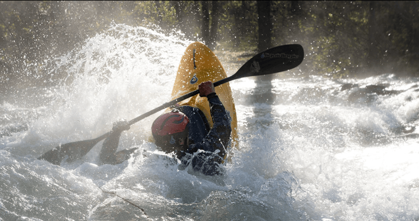
As an avid whitewater kayaker, I found myself wishing for an app that answers one question at a glance: is my river running today? Other tools were clunky, complicated, or not mobile friendly. So I built one. Designed by me. Prototyped and coded with AI tools. Shipped solo.
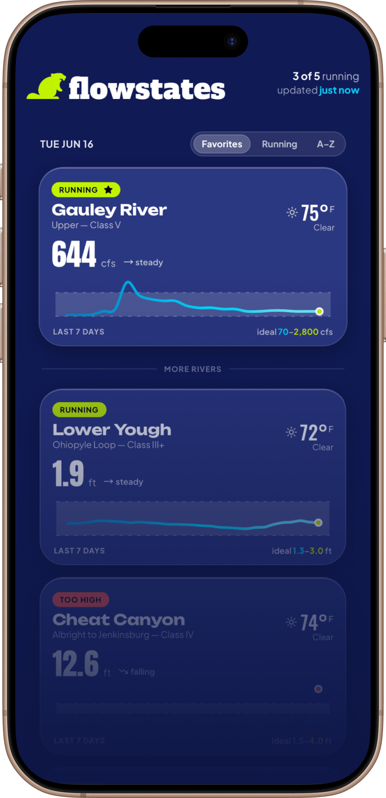
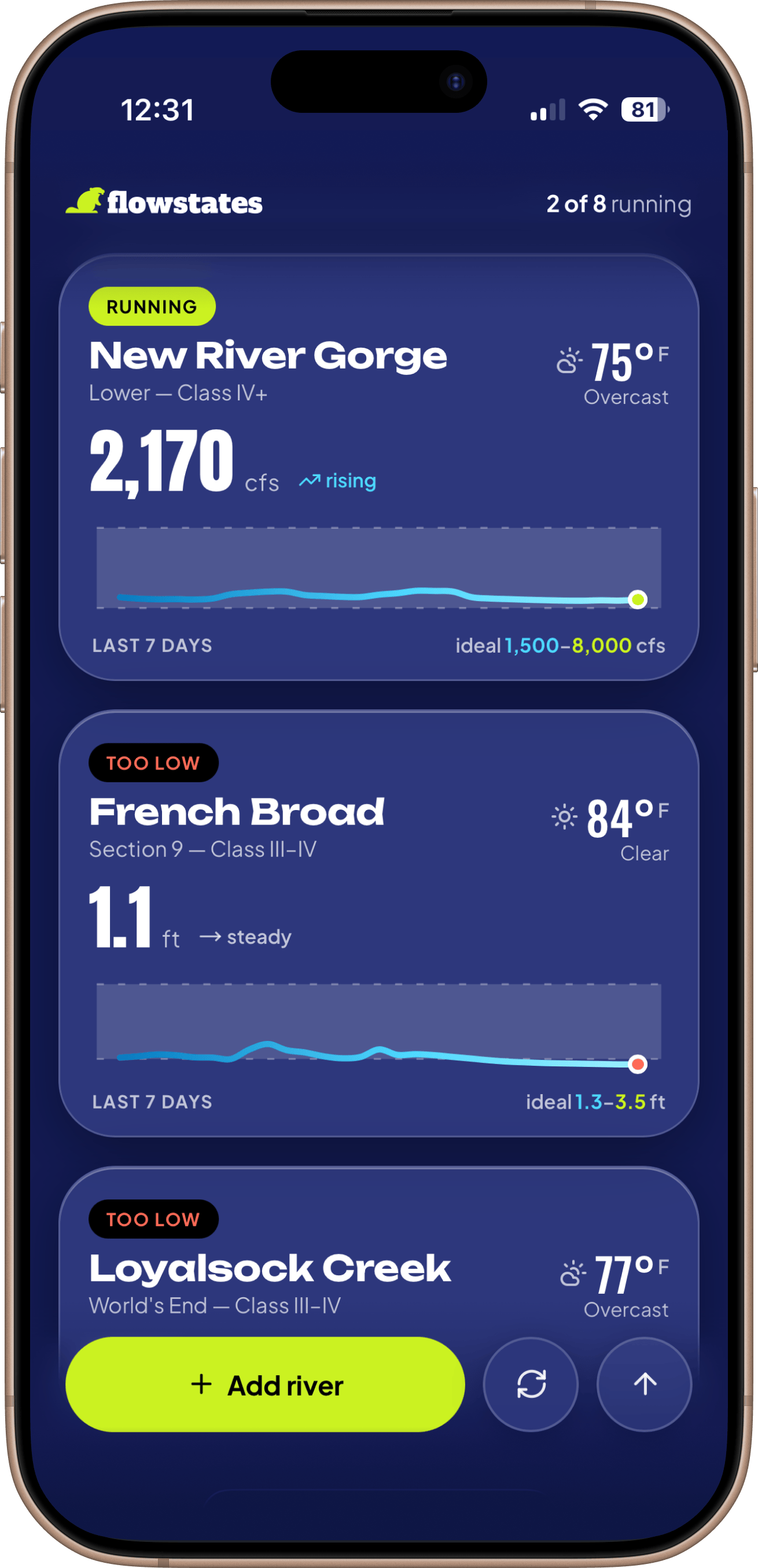
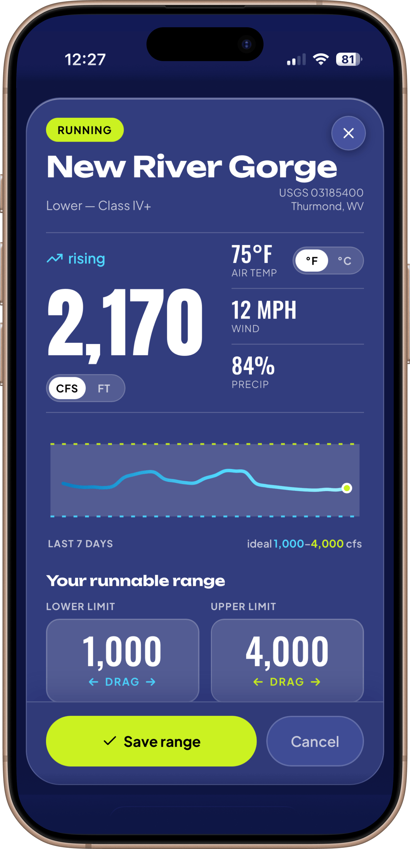
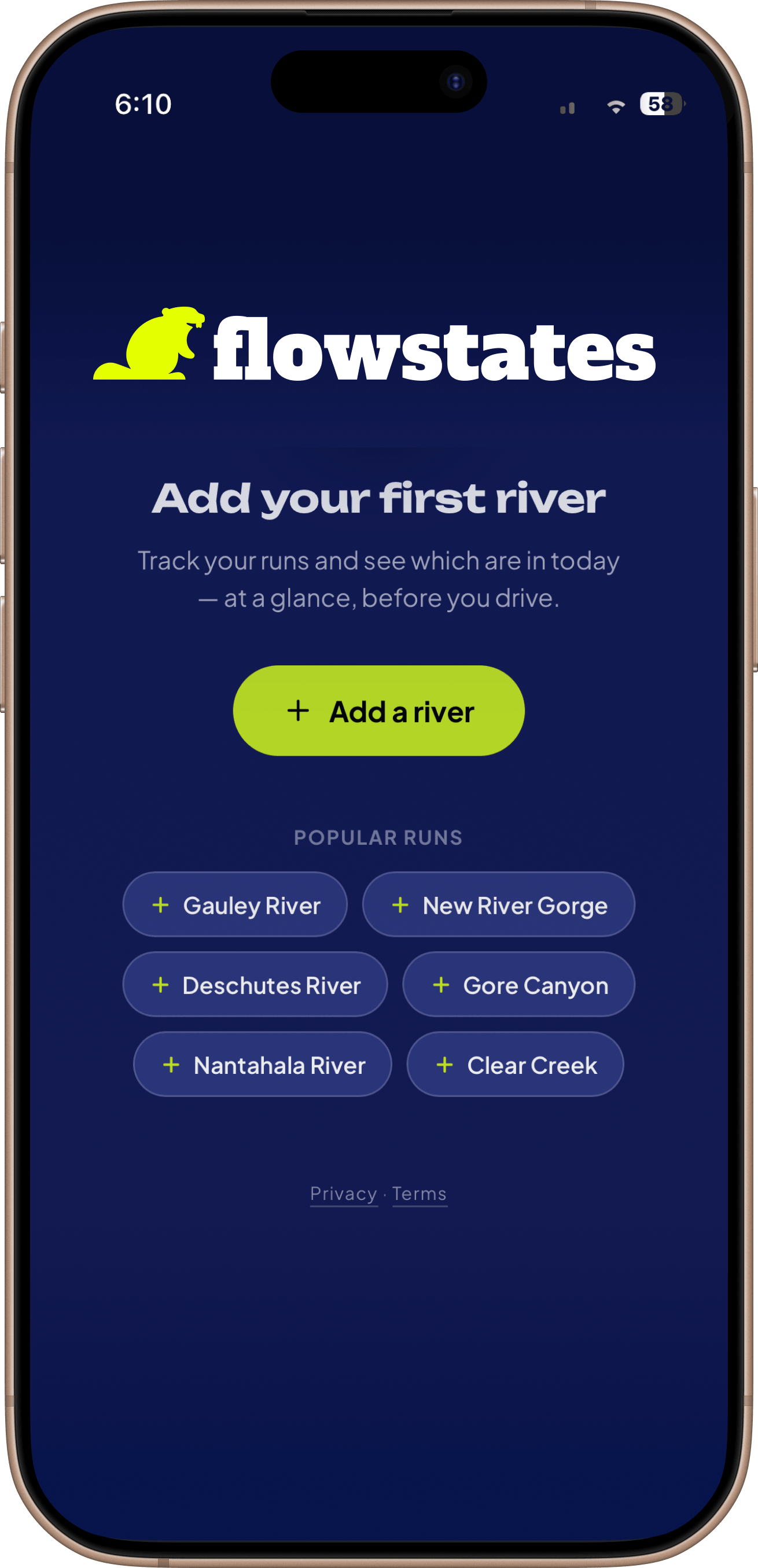
Live USGS gauge data and put-in weather, lined up against the range a paddler already knows is good. One screen, no taps after it loads.
- Role
- Product and UX design, solo
- Scope
- Self-initiated, shipped
- Tools
- Figma, Claude Code, React, GitHub
- Year
- 2026
02 — The problem
A gauge reading on its own is only a number.
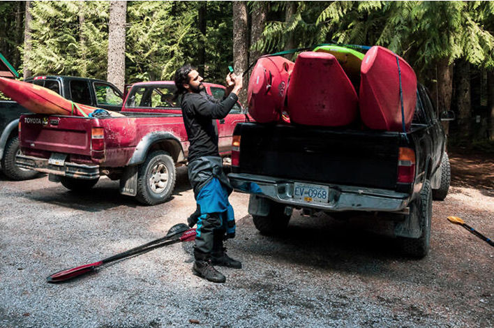
River conditions matter, and they fluctuate. Knowing the right levels can be the difference between a fun day and a dangerous one. Right now paddlers answer "is my river running?" the hard way. Find a site with a river gauge and read a raw number. They remember, from their own time on the water, what range is good for that stretch. They check the weather somewhere else. They fill in the rest from feel and word of mouth.
The data is all there. It is just scattered, ugly, and useless without expertise.
The number only matters next to one thing: this paddler's sense of what runs well on this section. That pairing is the whole product.
03 — Data & licensing
A confluence of data.
The whole app rests on a combination of data that yields a range a given run is good to paddle.
Three layers of data
Let's look at what this data actually is, layer by layer.
- Readings Public
- The live flow and height come from public gauges, USGS in the States and ECCC in Canada. Free to anyone.
- Gauges The gap
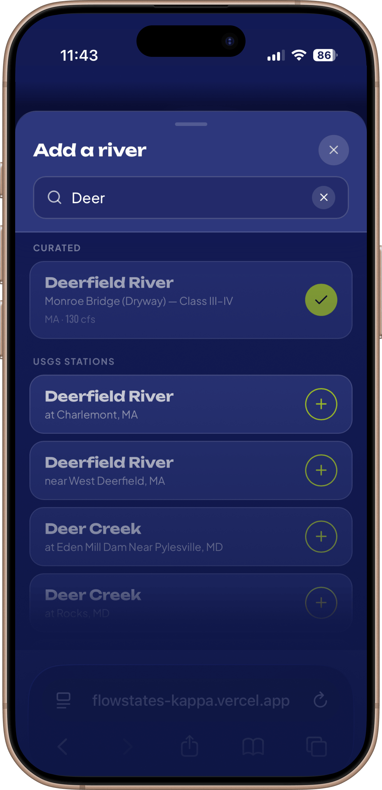
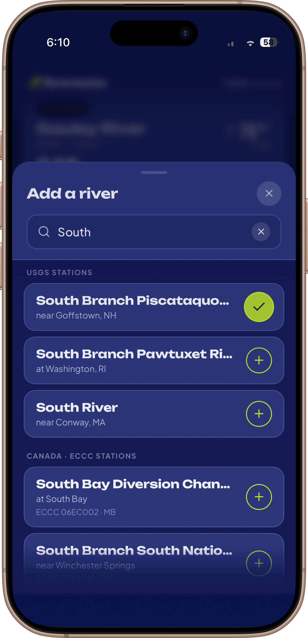
- USGS calls it "03189600." A paddler calls it the Upper Gauley. Nobody searches for a gauge. Paddlers think in runs and rivers.
- Ranges The moat
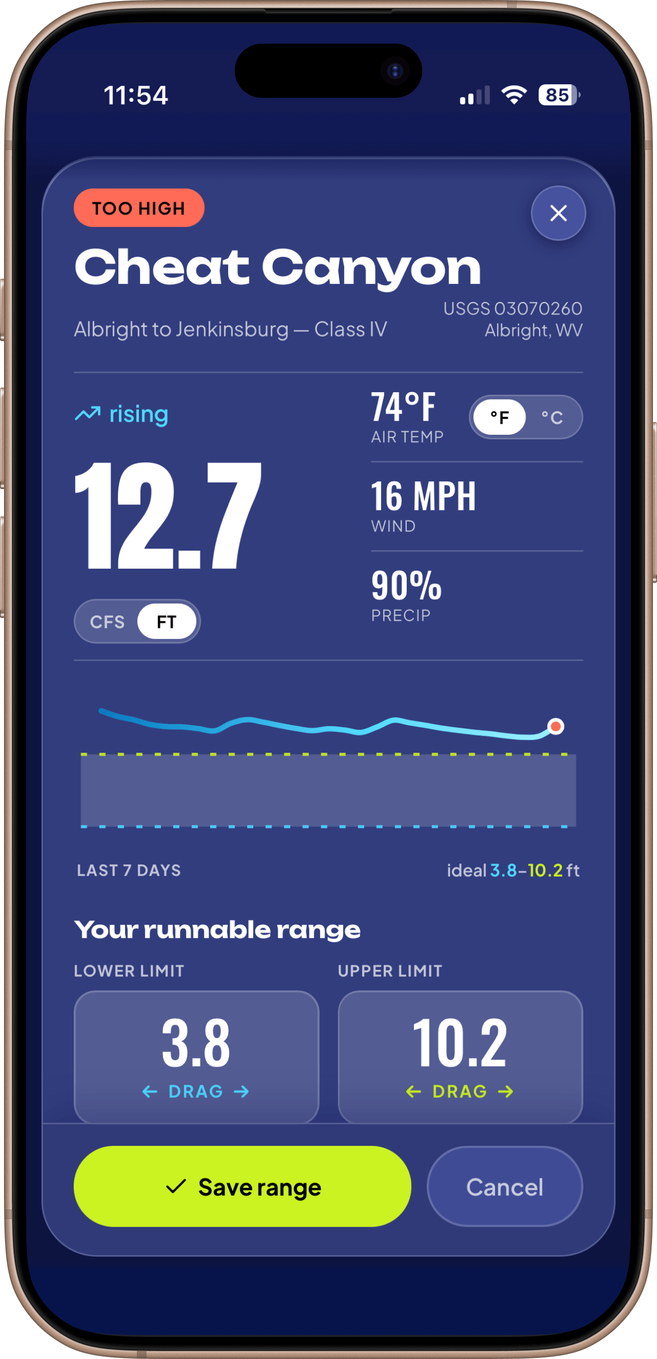
- The consensus that a run is good between this number and that one. The piece that makes the numbers useful. I wanted each paddler to be able to enter their own preferred ranges.
That last layer is the real moat. The public gauge data gives you a reading and a clinical label. It does not tell you which run that number belongs to, or when it is good. Assembling that map, run by run, is the work.
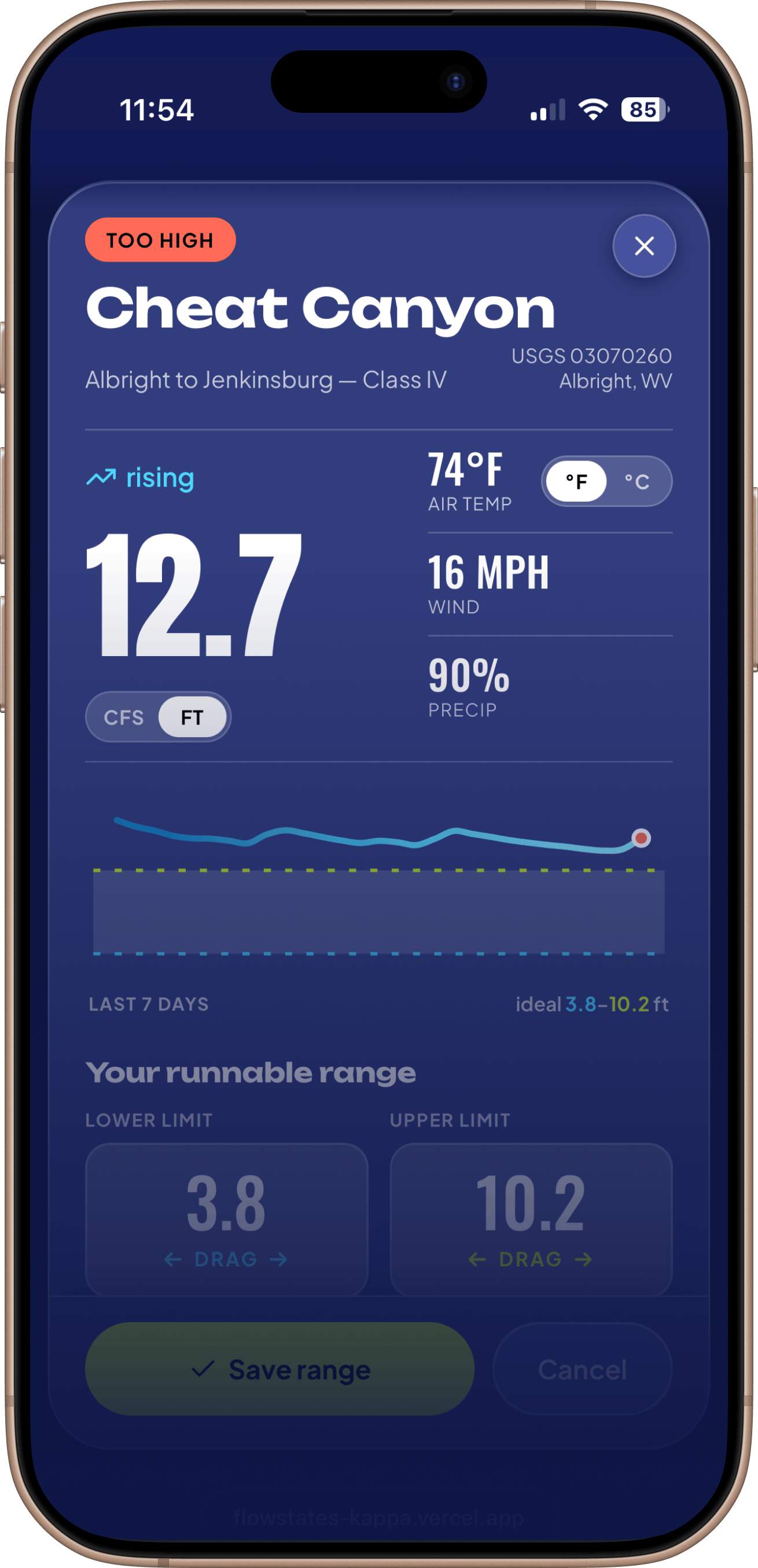
A unique control I came up with for this specific purpose. River flow cfs can run in the thousands. Too far for a slider, and I thought I could do better than making you type. So you press the number and drag sideways, and it rises and falls with your thumb.
Connecting the dots
Matching every gauge to the name a paddler actually uses is a country-sized job. So I went looking for sources I could legally build on, and they exist. OpenStreetMap has open whitewater data under a usable license, with attribution. Public USGS and GNIS records cover the plain geographic facts. Those seed the names.
Paddlers enter their own preferred ranges, which works great for their known runs, but not for new-to-them runs. A starter range is the ideal solution, but the scale of hand curating that is enormous. Crowd-sourcing is the answer. Once enough paddlers have entered a preferred range, I can take the average upper and lower and create a recommended starting range.
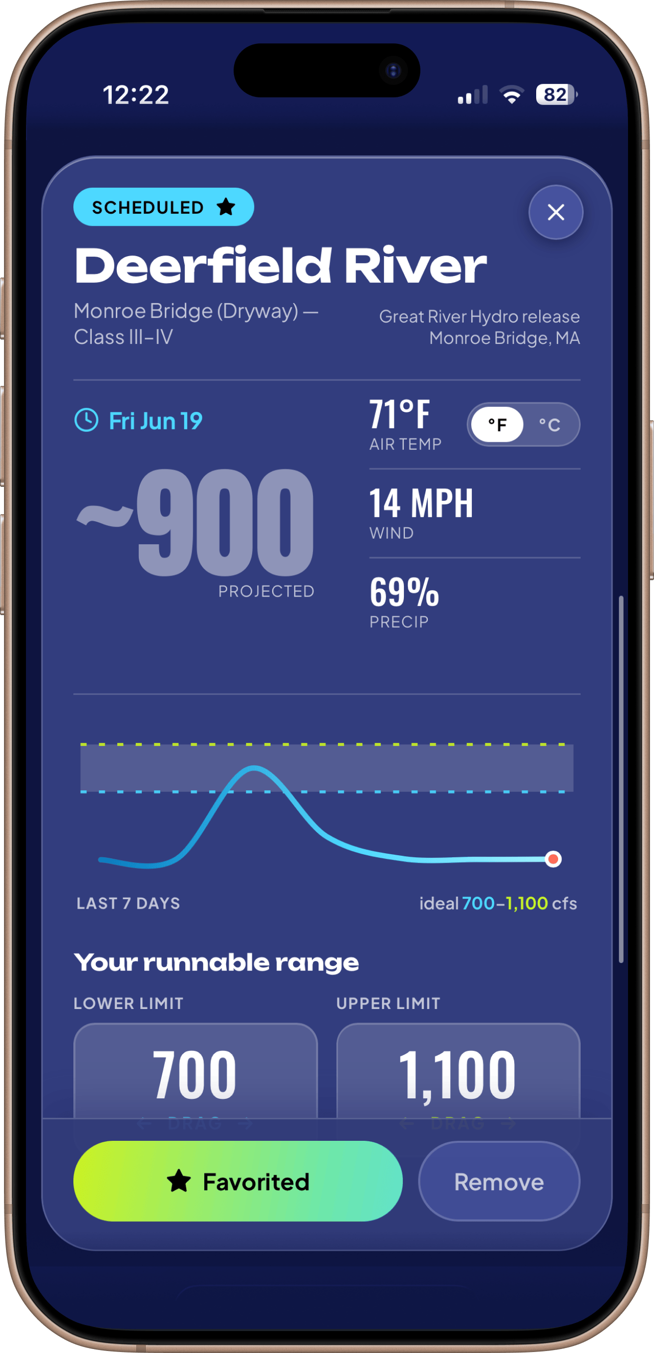
To get things started, I'm entering the famous runs myself. The Gauley and the New in West Virginia, the Lower Yough in Pennsylvania, the Nolichucky in Tennessee, Gore Canyon in Colorado, the Deerfield in New England. Entered from knowledge, by hand, in the hundreds. It does not scale. That is fine. It only has to hold until there are enough paddlers to take it over.
04 — Design system
Designed with intention for AI workflows.
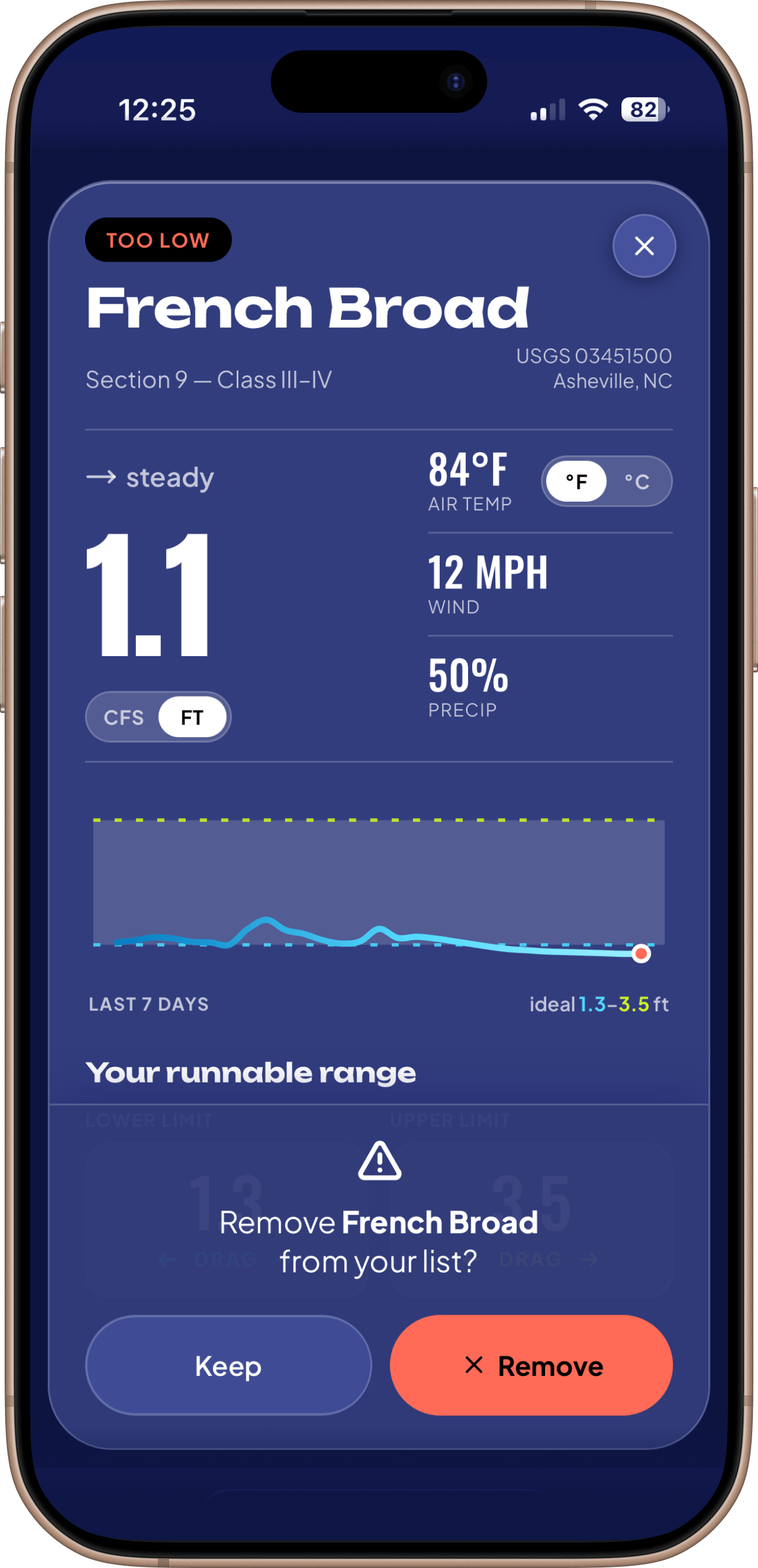
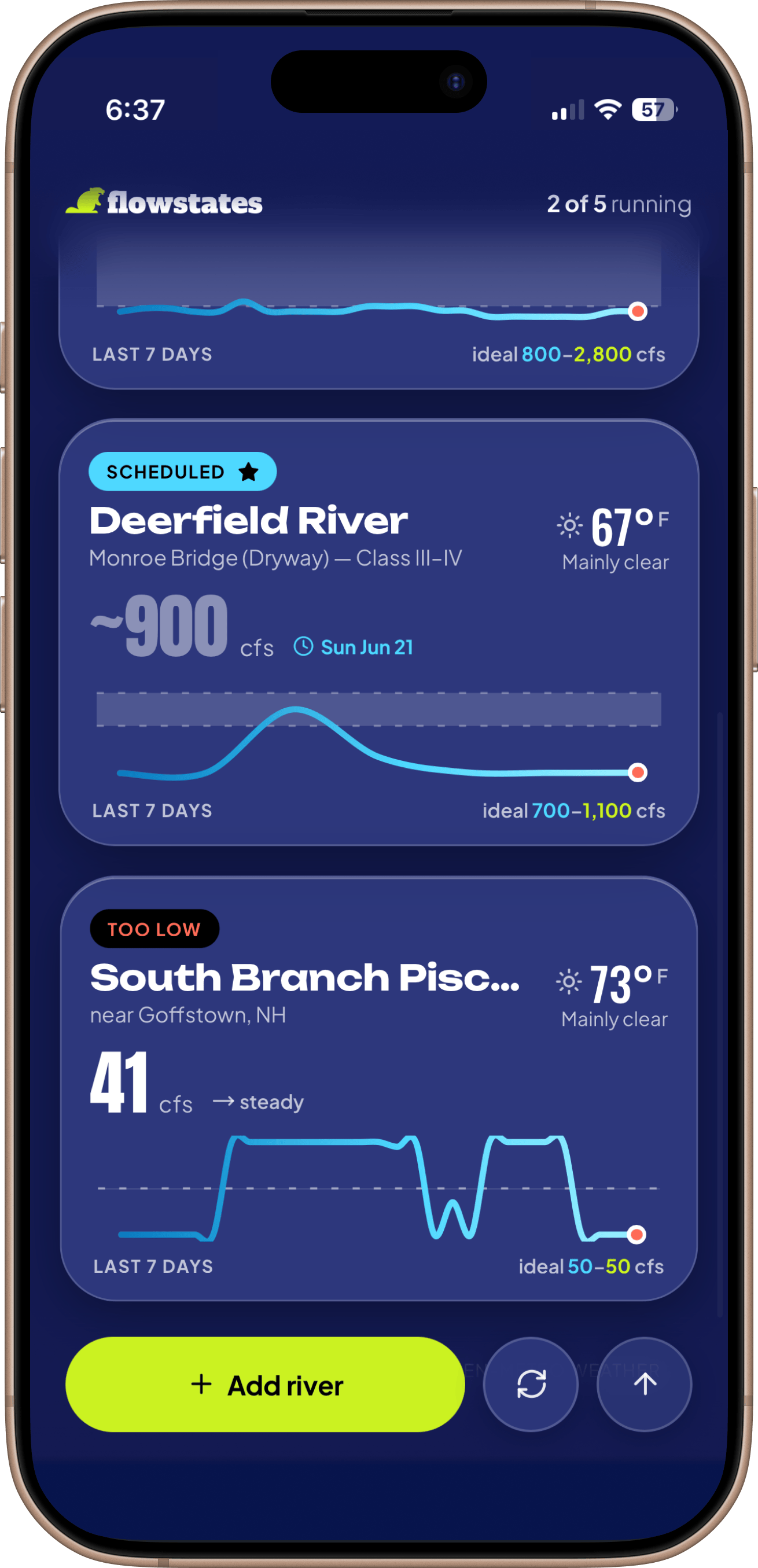
Status is the fastest thing to read, so it is pure color. A run that is good glows lime. Too low fades to amber and too high flares coral. A dam release that has not started yet sits in a cool blue. You can scroll the whole list and know which rivers are on before you read a single number.
- RUNNINGgood to go
- TOO LOWunder range
- TOO HIGHover range
- SCHEDULED ★release coming
I set my design intent in Figma with initial screens and components. I used Claude to turn it into the system, and then a prototype, and I then steered Claude Code to build. These tools can build anything. Without direction, they build the wrong thing and make it look finished. AI makes confident mistakes. Catching them takes real design craft, a clear point of view, and a plan for where it all goes. Without that, I would not get what I wanted. With it, the tools gave me a system in real code. The actual artifact, not an abstraction.
The tokens are how I kept it honest. Every color, size, and corner radius lives in one place. Change the accent once and it moves everywhere, the buttons, the running badge, the line on the chart. I kept the whole system small, which took more discipline than letting it sprawl. A few colors, two typefaces, one accent. A heavy face for the names, a tighter one for the numbers. It holds together across every screen, and I can grow the app with no design drift.
- Go Lime #B8FB28
- River Teal #354D51
- Deep Ink #1B332E
- Surf Cyan #4DD8FF
- Amber #FDBF7D
- Coral #FD927D
The lime is the signature color, and it means GO. A good run gets it, and so does the button to add one. When you see a lot of lime, your rivers are running. Get out there.
05 — Motion
It is a numbers app. It does not feel like one.
flowstates runs on government numbers. Gauge readings, flow rates, a chart. Left alone, that kind of data reads like the website it came from, a spreadsheet you have to decode. I did not want that. I wanted it to feel alive in your hand, like a real product and not a readout. With a UX this lean, a few screens, that feeling had to come from motion.
Getting one to feel right was harder than making it work. A spring has no setting called "right." So to steer the tools, I had to name the feeling I was after. Claude and I built a small vocabulary for it. Jelly. Inertia. Boing. Squish. I would say a tap needed more boing, or a card was landing too stiff, and we tuned it until the word matched the motion. Naming the feeling was how I got the feeling. None of those words belong in a spec. They were the only way to get a tool to build what was in my head.
The other half was cutting. Each of these was good on its own. Stacked together they fought. Things slipped out of timing, the screen flickered, two animations wanted the same moment. So the real work became subtraction. I kept the few that carried the feel and cut the rest, even the ones I liked. The work was knowing which ones to protect.
None of it runs long. A few hundred milliseconds each. Enough to feel, not enough to wait on.
06 — Branding
A serious tool with a beaver on it.
To me, branding is part of the craft, not a coat of paint at the end. A working build proves the app runs. The name, the mark, and the voice are what make it feel like a considered product instead of a tech demo. So I gave them the same attention as the screens.
The name
We all know the feeling of a flow state. Being so deep in the moment that everything else drops away. That's exactly what good whitewater gives you. It is also literally the state of the flow, the number the whole app turns on. Two meanings, one word, perfect.
The mark
A beaver. Not a decoration. It lives in the river and reads its flow, which is the whole app in an animal. Its tail is a paddle, the gear the app is built around. And a beaver's range is North America, the US and Canada, the exact water the app covers. The mascot lives on the same map the product reads.
The branding feels true to the mission, true to the community, fun, and memorable.
07 — Outcomes
Live, on real data. Designed, built and shipped solo, ready to get people on the water.
flowstates is in production. It pulls live readings from USGS and ECCC, thousands of gauges across the US and Canada. Eighteen of them are runs I curated by hand, ranges and all. The rest are there to add. You install it on a phone and check it anywhere. It runs on free public data and a dataset I built, so keeping it alive costs almost nothing.
- 4
- live data sources
- 5k+
- gauges available
- 8
- days zero to one
- 1
- designer, solo
It is new, only days old. Friends and family are using it, but I have not promoted it to anyone else yet. I will keep testing and iterating, and push it past my own circle slowly.
Eight days from idea to launch. I spent most of that time on the feel. It mattered to me that it reads as a carefully considered product and not a database with a search box on it. The data layer was the smaller half, a stretch of plumbing.
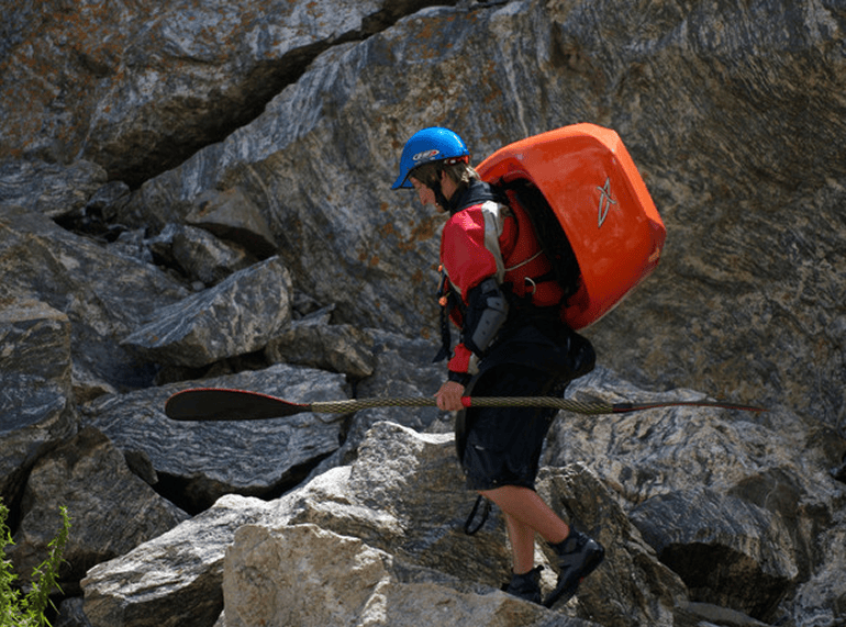
And I came out of it with more than the app. The real outcome is how I work now. I learned to direct these tools, not just prompt them, and to catch a good answer that was still the wrong one. When I hit a real wall, the licensing problem, the motion that fought itself, I learned to work through it with the tools instead of around them. That is a way of working I did not have before this, and it is what I carry into the next project.
What I know is that it works, it shipped, and the hard calls were mine.
08 — Try it live
It's a real app. Go run a river.
Live USGS and ECCC data, installable, running in production. Not a prototype. The shipped thing.
If the screen stays blank, the app is declining to be framed. The button opens it directly.