
Bleacher Report App Onboarding
Onboarding
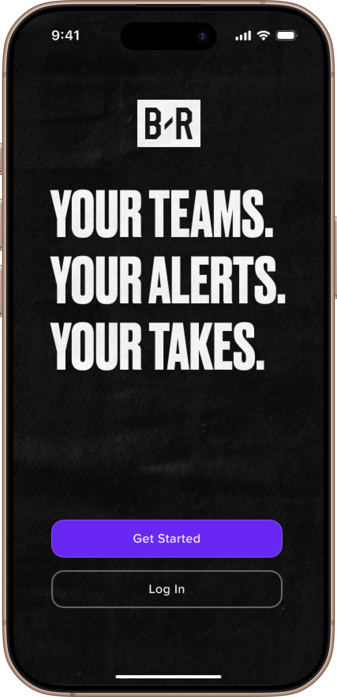
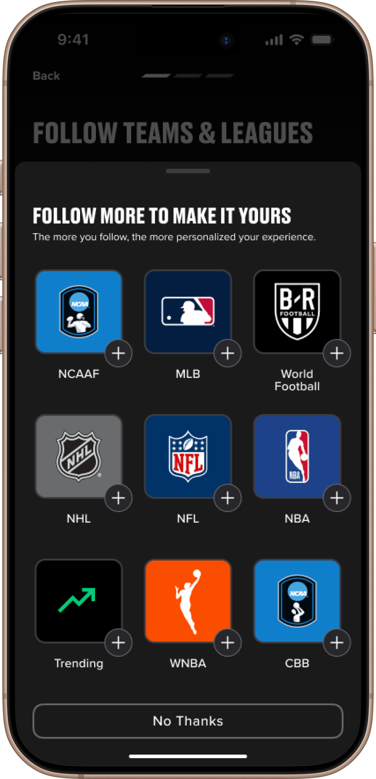
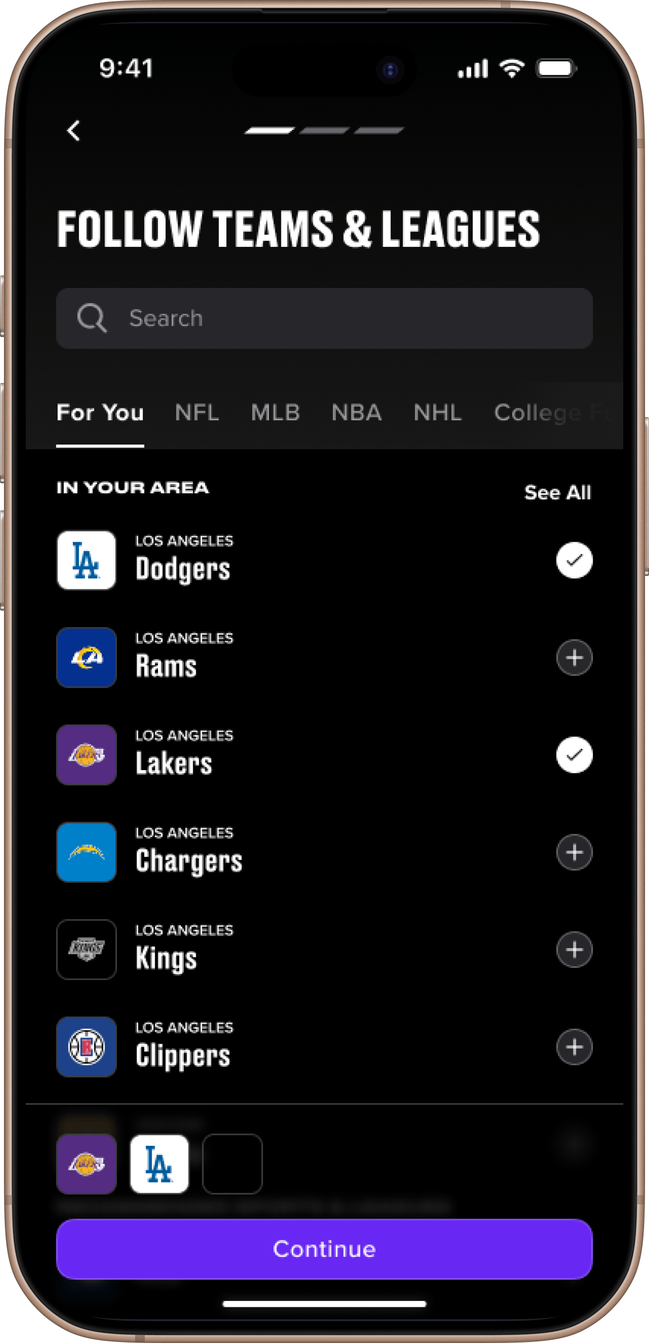
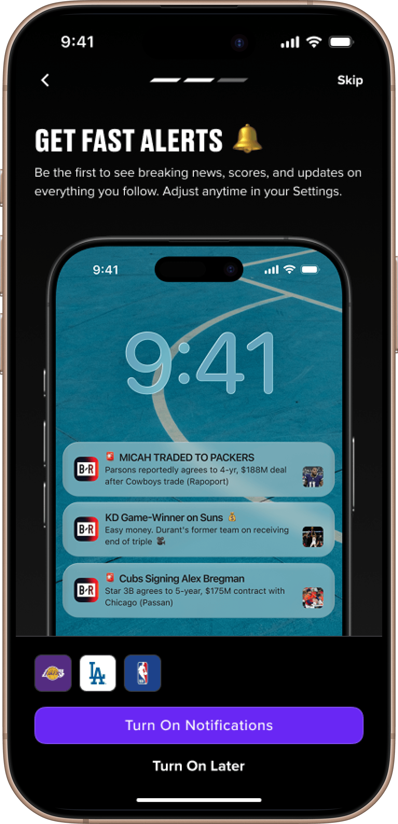
A redesign of the B/R app's onboarding flow, built around the handful of early actions that actually predict whether a new user comes back.
01 — Overview
Turning new users into returning fans
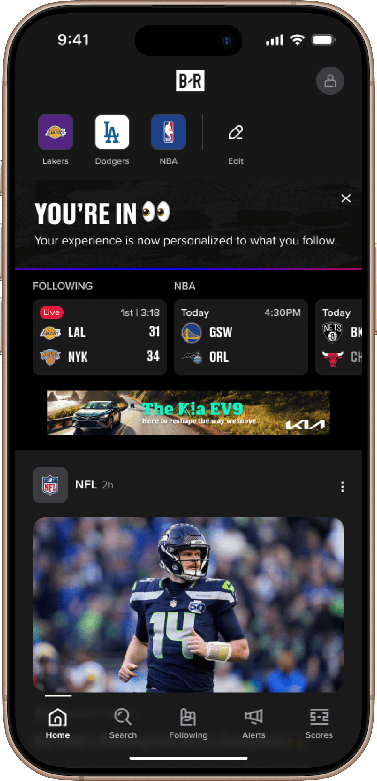
In the Bleacher Report app, onboarding serves both as the introduction to the product and the beginning of personalization (choosing favorite teams and leagues, and setting alert preferences). Data showed that people who follow teams and turn on alerts are likely to return. People who do not, mostly do not.
This was a redesign aimed straight at communicating value and reducing the friction around those early actions that predict retention.
02 — Opportunity
Three friction points were quietly driving drop-off.
A usability study showed users slowing down or quitting partway through, right before the steps most tied to retention. The old flow also ran longer than it needed to, with too many screens between opening the app and reaching the feed. Three friction points stood out.
- Discovery
- Finding a team was manual. You had to know what to search for, dig through tabs, and hope you spelled it right. Local teams, the ones a new user is most likely to want, were not surfaced for you.
- Notifications
- They were all or nothing, and the value of opting in was not well communicated.
- Registration
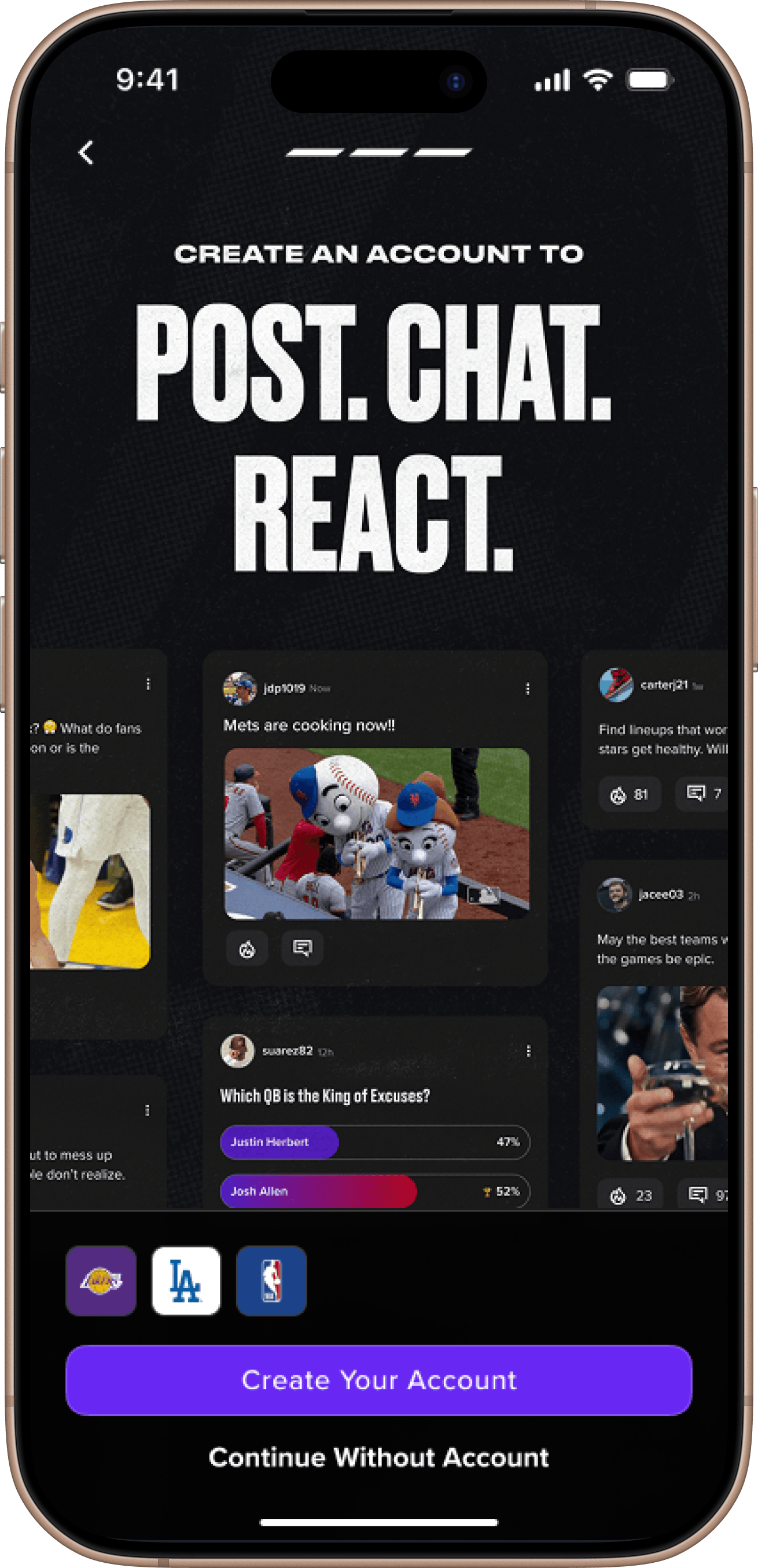
- The app asked users to register before they had seen a single reason to want an account.
03 — Role & Scope
Framing the problem.
This was mine to frame. I set the brief, a one-page flow that got users to value faster, and I named the three friction points worth solving, so the work stayed pointed at drop-off instead of spreading thin across a full rebuild.
Then I chose the designer. It was a high-visibility, high-importance project with executive attention, and I assigned it to someone I had picked for sharp UX instincts and strong visual range. My job from there was less about the output and more about getting the best version of their thinking onto the screen.
- Role
- Design manager and project lead
- Scope
- Framed the problem, set the brief, chose the designer, steered the work
- Status
- Live with an initial cohort. Early indicators strong.
04 — Approach
Approach
Rather than rebuilding onboarding wholesale, I focused the work on the three friction points driving drop-off and coached a designer toward solutions that fixed them without overbuilding. My management approach was to create the conditions for the best work rather than direct the output. I let the designer's expertise lead while pushing the thinking beyond the immediate category. We met as a team to put ideas to the test and to challenge each other.
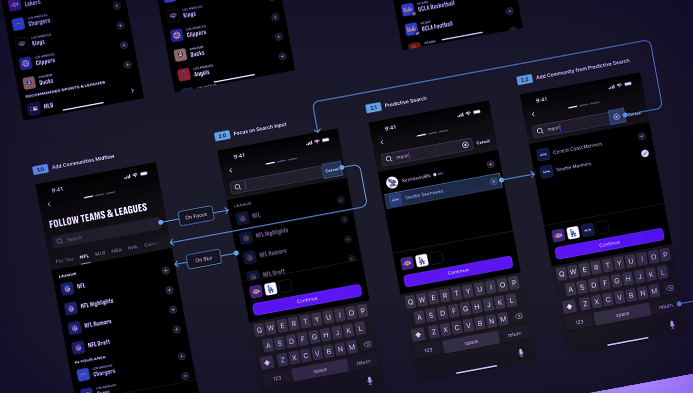
Sports onboarding has established conventions, and I wanted those pressure-tested against what low-friction, high-utility onboarding looks like elsewhere. I challenged him on edge cases, on sequencing logic, and on whether each step was earning its place in the flow. The goal was to get to the strongest version of his own thinking.
05 — Finding Teams
Making it easy.
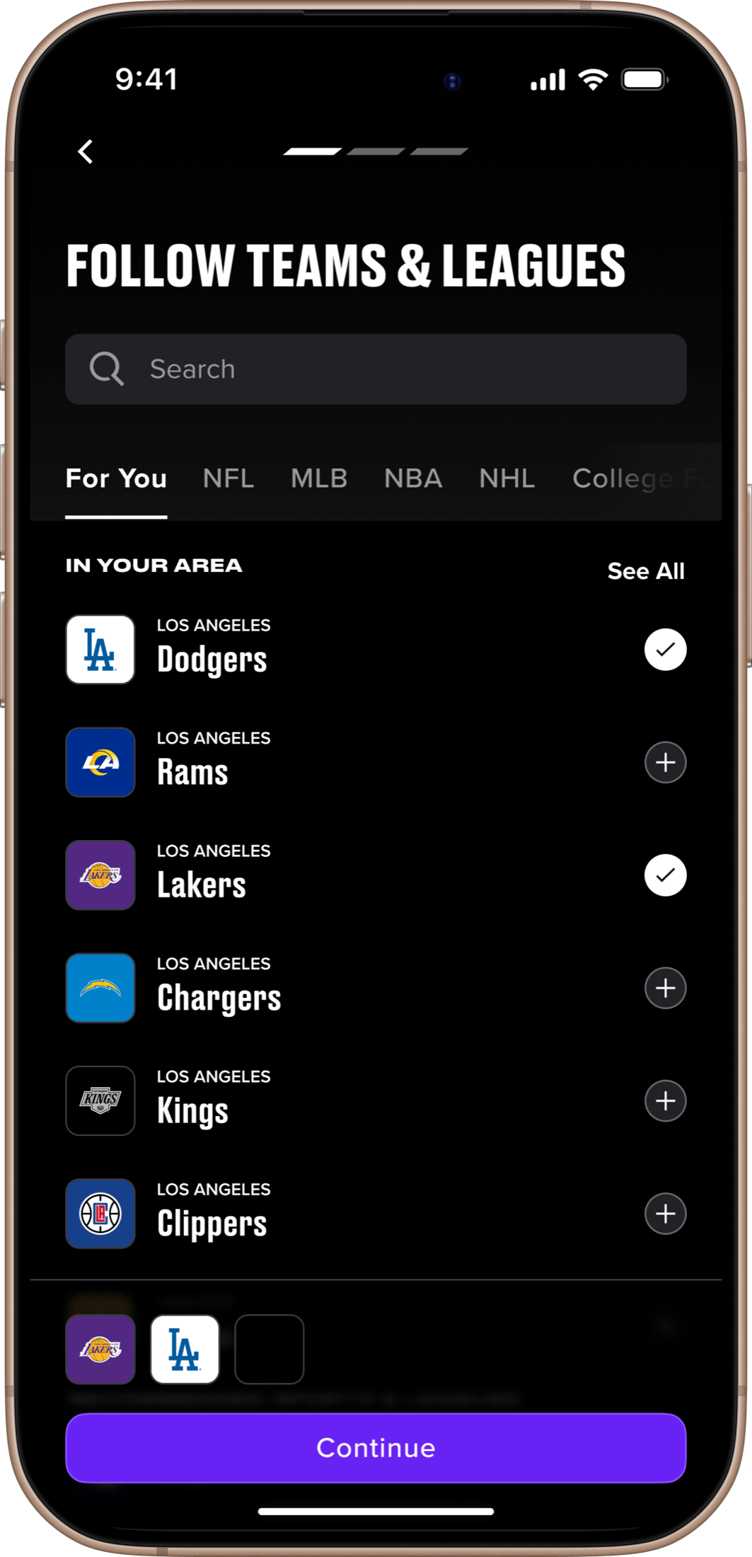
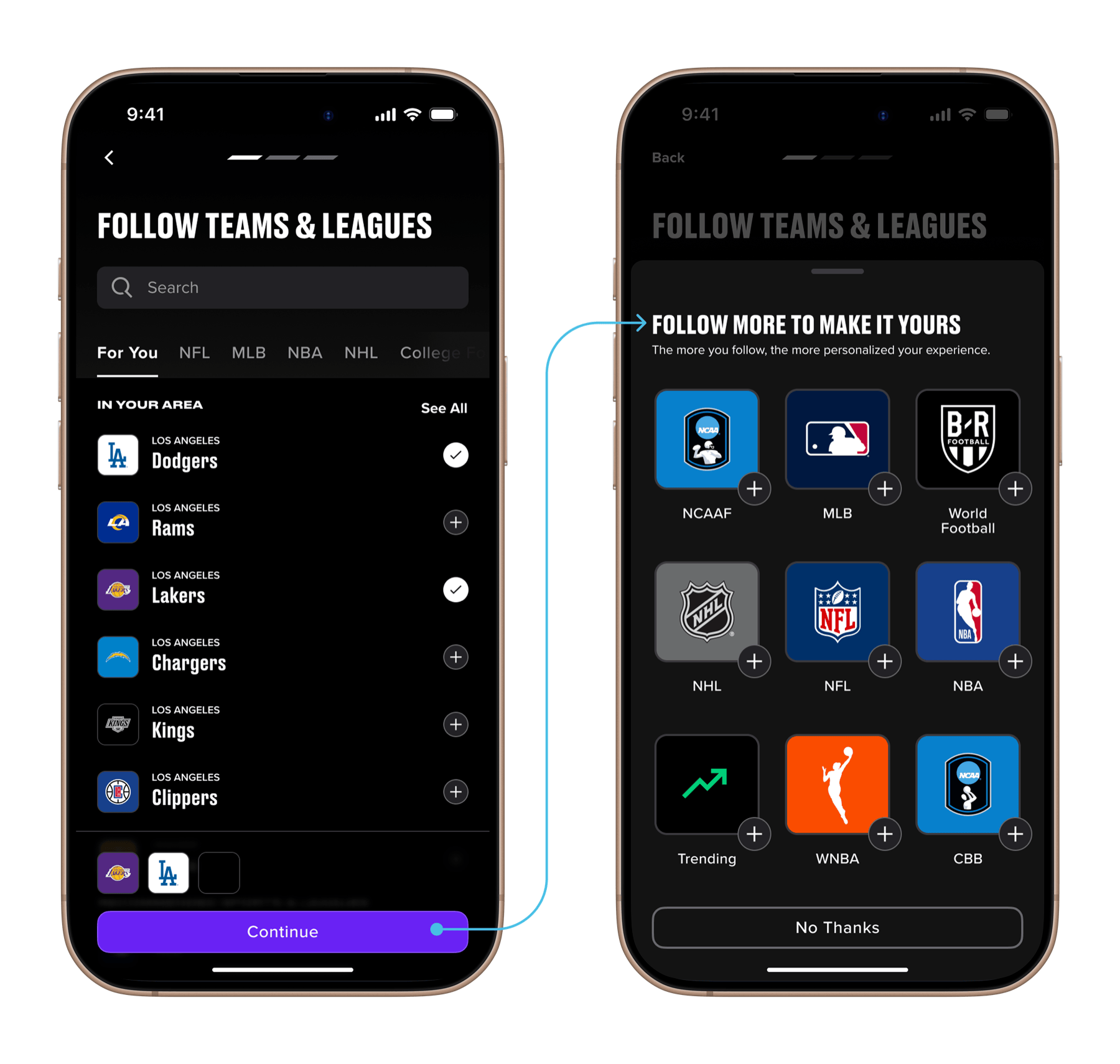
The fix for discovery was to take away the burden of knowing what to look for. I pushed for surfacing local teams automatically, the ones a new user most likely wants, and for building in tolerance for misspellings, so one wrong keystroke did not end the search.
06 — Alerts
Selling the opt-in.
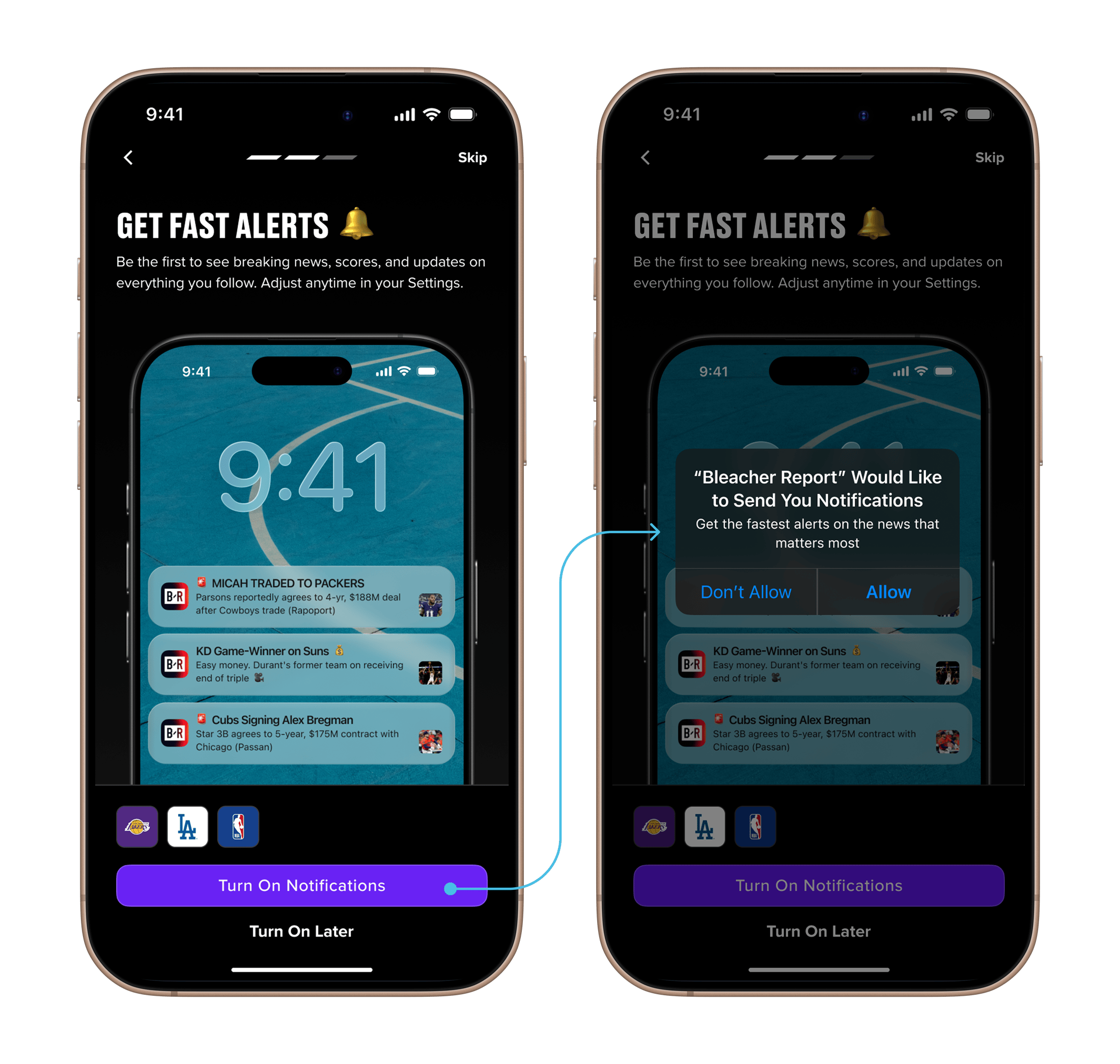
Alerts are a powerful re-engagement lever for BR's business, and BR's alert speed and quality were ahead of the competition's. We just needed people to opt in. I brought in copywriters and graphic and motion designers on this one, to really sell the value of alerts and to treat it as a brand moment for BR, reinforcing why you are doing this onboarding to begin with. Finally, we tested all-or-nothing alerts against more granular control, to see which performed better. The all-or-nothing version won.
07 — Timing the Ask
Sequencing the registration.
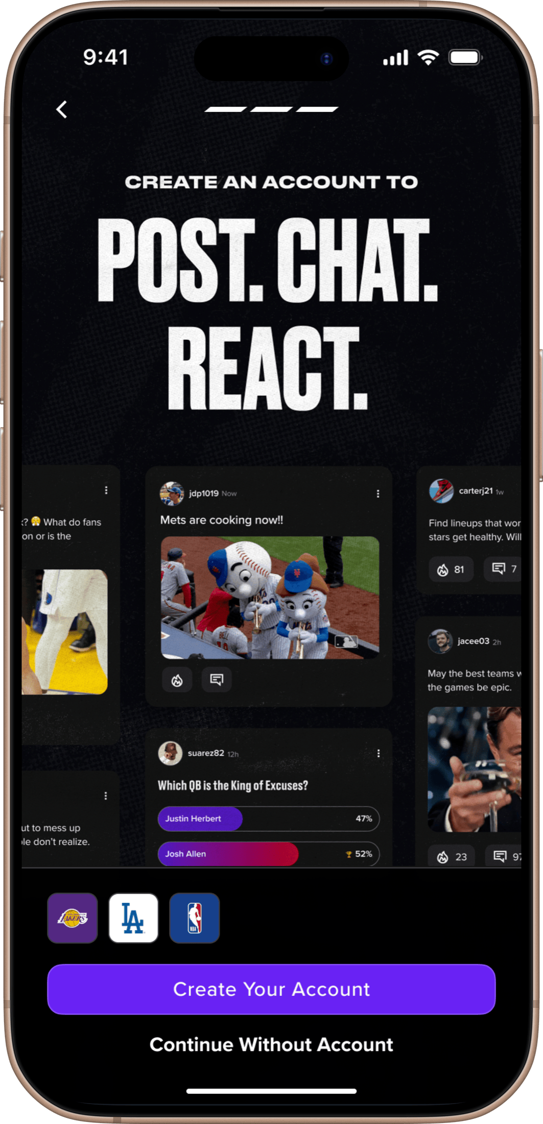
A sign-up wall on app load asks for commitment before giving any reason for it. We reworked the sequence so the account prompt arrived at the right moment, after the user had something worth saving, paired with a plain case for why an account was worth creating. Same ask, much better timing.
08 — Beyond the Brief
The brief fixed friction. We went after retention too.
The brief was to remove friction. We took it one step further. The data showed that users who follow five or more things, communities, teams, leagues, or interests, are the ones who stick. So we added a prompt that surfaces more teams based on what someone has already picked, while we still had their attention. Fixing the flow was the assignment. Moving retention was the point.
09 — Outcomes
Early, but moving the right numbers.
The new flow is live with an initial cohort of new users, so these are early reads, not final ones. They are pointing the right way.
Onboarding by the numbers
- +7%
- Completion — More new users finish the flow, and the lift showed up almost immediately.
- +1.5
- Teams followed — Among users who complete onboarding, the average number of teams followed rose by 1.5.
- +10%
- Alert opt-ins — More than 10% more of the users who finish are turning notifications on than under the old flow.
None of those is a vanity metric. Each one is a behavior that tracks with whether a user comes back.
10 — Why It Matters
Onboarding is the highest-leverage moment in the product.
Our most committed users follow five or more communities and keep notifications on. Both behaviors track directly with retention. So moving new users toward them early is not a nicety. It is one of the highest-leverage things the product can do, and it happens in the first few minutes someone spends in the app.
That is why onboarding earned this much care. It is the cheapest place to build a habit, and the easiest place to lose one before it forms.