Bleacher Report App Social Layer
Social




A social layer for the Bleacher Report app, built to make a place full of fans actually feel like one.
01 — Overview
A crowd waiting to happen.
Sports fandom is loud, communal, alive. The Bleacher Report app had every ingredient of it. Shared teams. Big games. Strong opinions. The fans were already there. The feeling of being among them was not.
I led the work to fix that. Not with one feature bolted on, but by building a social layer that carried the energy of a live sports moment to fans wherever they were. A reason to come back for each other, not just the score.
02 — Opportunity
Sports moments, together.
People were already in the same place at the same time, watching the same game, experiencing the same moments. They just had no way to feel each other there. That was the opening.
I made the case for a holistic, discovery-led social layer that made the app feel inhabited. Social you can feel.
03 — Role & Scope
Solving the right problems.
As design lead, my job was framing, direction, and thinking. I coached the design team and steered the work toward high craft and elegant solutions. I made sure we aimed at the right problems and pushed to the highest level we could reach.
- Role
- Design lead. I set the direction, framed the problems, and pushed the team to the strongest version of the work, not the hands-on design.
- Status
- Live. Early indicators strong, with a foundation and a team set up to keep building.
04 — Approach
Right place, right time.
I brainstormed with the design team around the right moments to introduce social features, to ensure they felt natural and approachable for fans who wanted that engagement, and not distracting for the rest. A few principles started to surface.
- Showcase community energy whenever and wherever it's happening.
- Protect the core experience and be mindful of clutter.
- Social engagement needs to exist on a spectrum, from quick reactions to deep threaded conversations.
05 — Live Chat
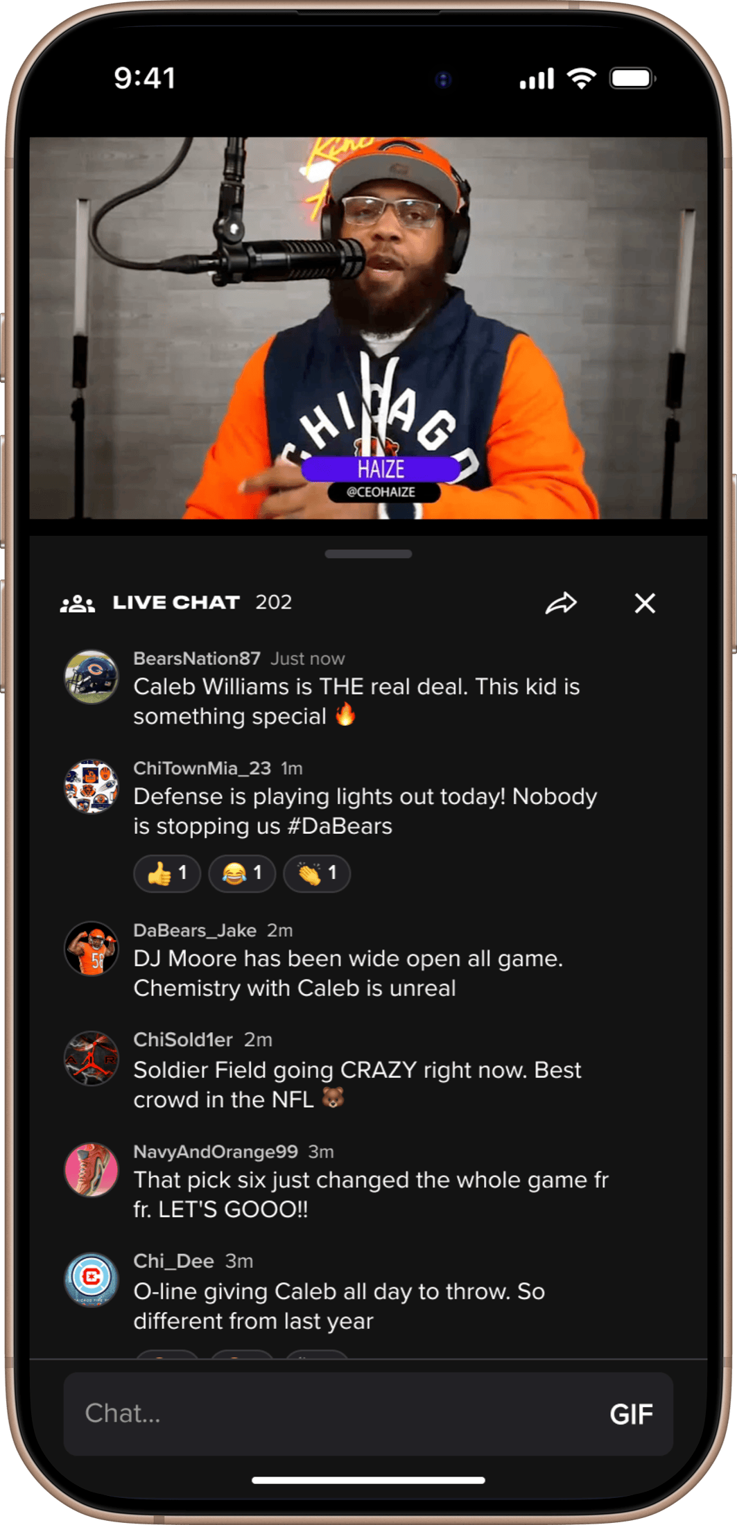
The pulse of the community.
- Insight
- Chat is the perfect feature to add social energy and togetherness to a live sports moment. But it presents challenges. It's ephemeral, so it needs to be accessible in the moment, but only in the moment. And, in the B/R app, different types of live experiences take different forms, but we knew a universal solution would be friendlier to users.
- Decision
- By wrapping the live chat experience in an expanding sheet, we could launch it from many different locations within the app (live games, events, creator videos) and it would always be able to take the same shape and form, building familiarity. The easy to access "floating action button" would let users know how active the room is, providing social proof.
- Outcome
- Live chat is now an integral part of the B/R app experience and users who engage with live chat show meaningfully longer session lengths. The success of the sheet interaction pattern led us to introduce it to our comments feature as well.
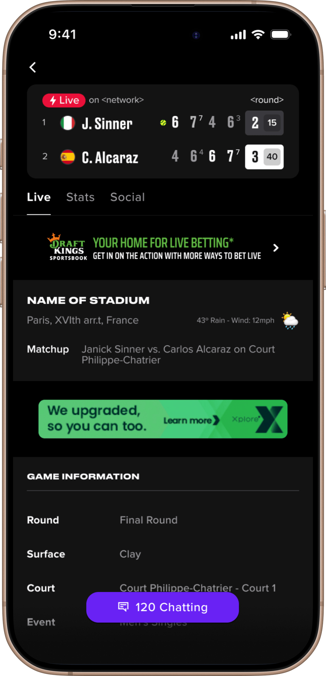 120 chatting
06 — Reactions
Low-effort, high-signal participation.
- Insight
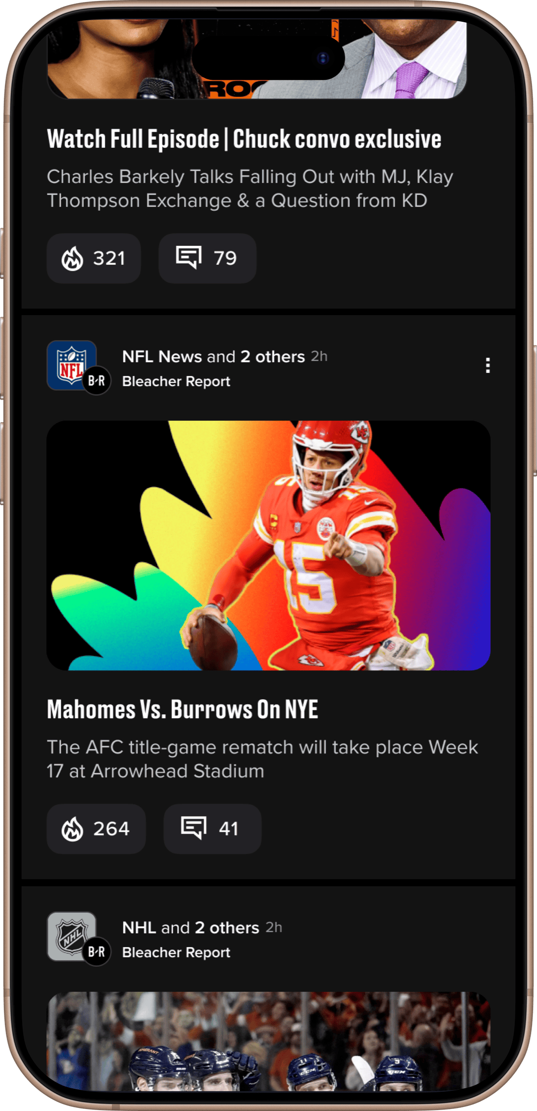
- Commenting has a participation ceiling: most users don't do it. But most users were already using the single available reaction, signaling an appetite for a lower-effort form of engagement.
- Decision
- I kept the team focused on reactions as a different form of engagement, not a lesser one. We focused on placement and timing — when is the right moment to invite a reaction, and where does it live without distracting from the content?
- Outcome
- Reactions measurably increased overall participation rates and created a new signal layer, giving users a quick read on crowd sentiment and surfacing what was resonating across content.
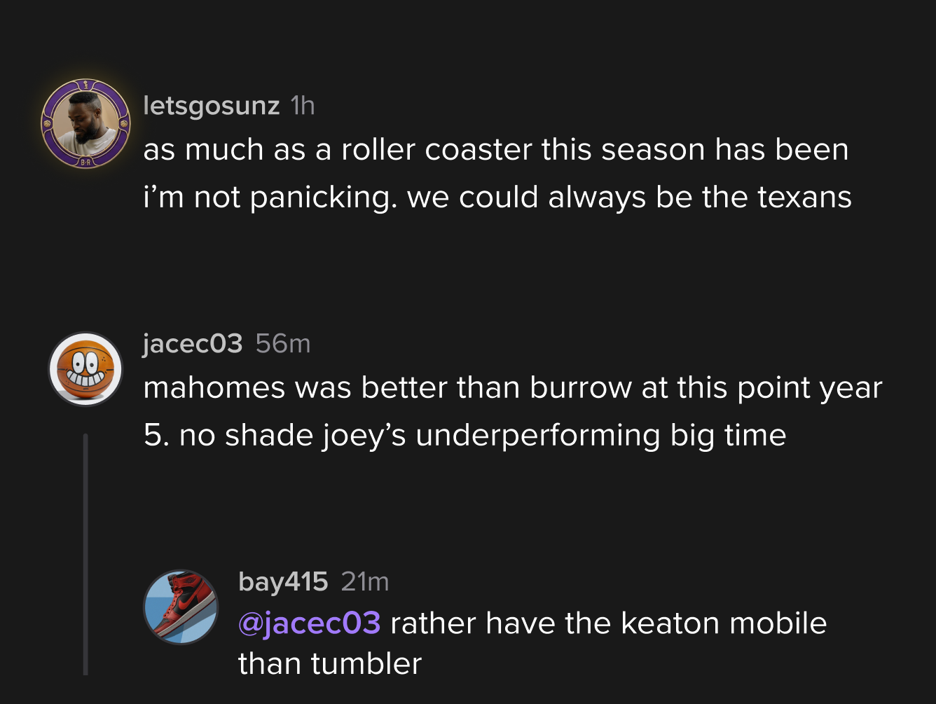

07 — Highlighted Comments
Let the conversation sell itself.
- Insight
- Many users didn't know commenting was available, and those who did weren't drawn in because they didn't know whether there was anything worth reading.
- Decision
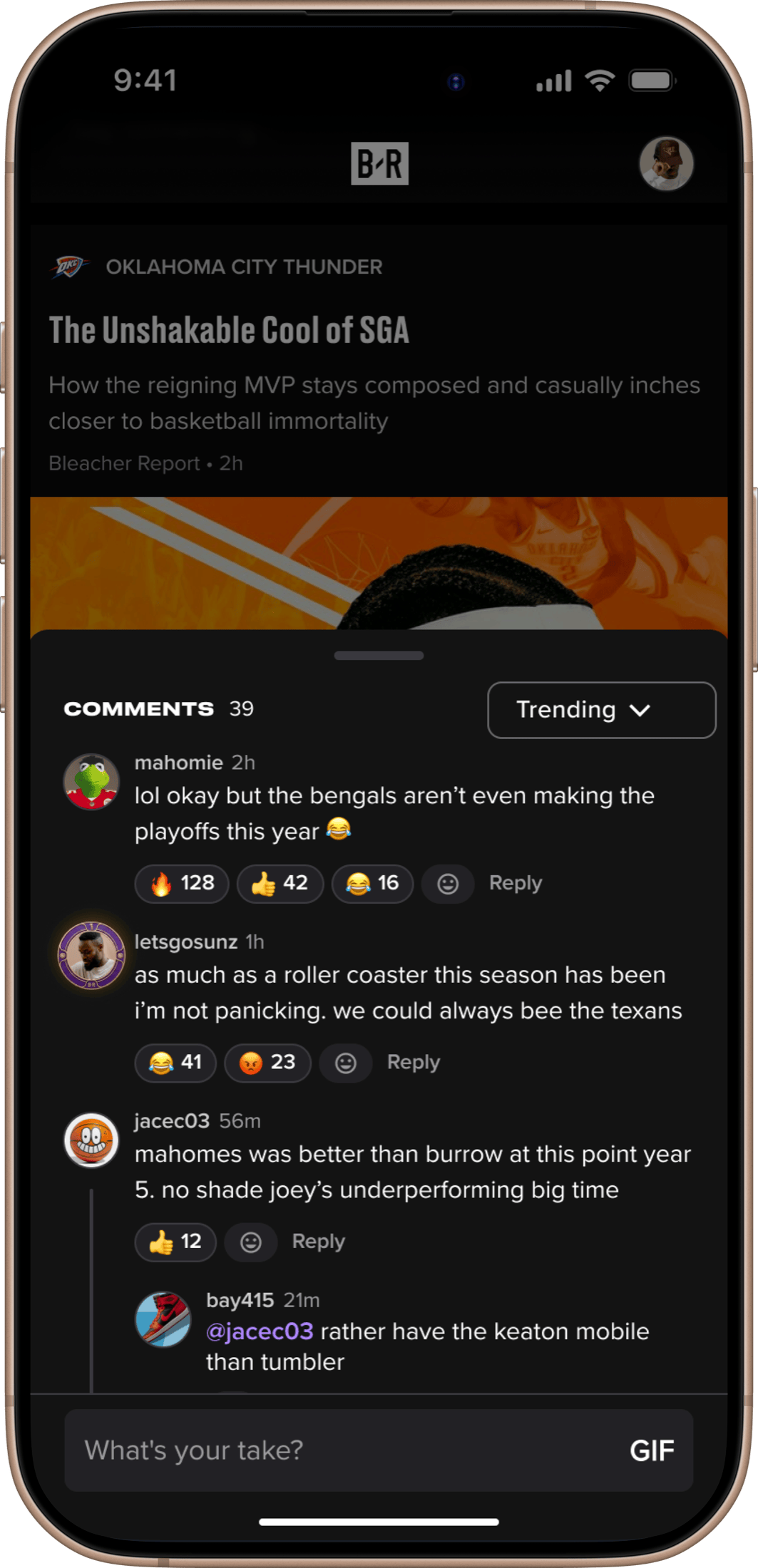
- I reframed the problem in brainstorming. The comment section needed to market itself. I challenged the team to stop treating it as a destination and think about how it could pull curious users in from the content view.
- Outcome
- Click-throughs to the full comment section increased significantly. An unexpected secondary effect: seeing a quality comment raised users' expectations of the community and made them more likely to contribute.
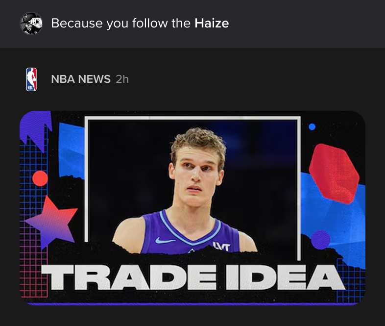


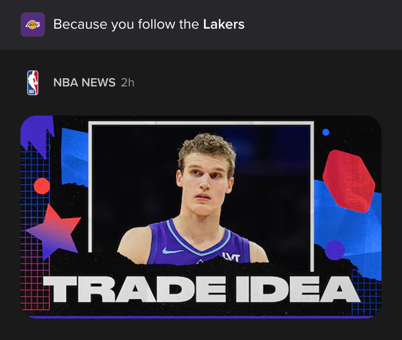


Encouraging engagement by surfacing the most relevant comment to a fan based on their fandom, social connections, and behaviors.
08 — Outcomes
Early, and pointing the right way.
These are early reads, and they point the right way.
Sessions run longer among users who touch the social features. The data suggests the social touchpoints are pulling people back, returning to see new reactions and replies to their conversations. And in interviews, people describe the app the way we hoped they would, as a place with a sense of community and connection that was not there before.
Social by the numbers
- +15%
- Comment visits — Visits to the comment section per session rose more than 15% after the Comment Sheet launched.
- Re-engagement — People are coming back to check new reactions and replies, which multiplies the value of every piece of content.
- Longer sessions — Users who engage with the social features stay in the app longer.
09 — Why It Matters
Where user value and the business meet.
The features matter, but the bigger outcome is what they set up. A foundation for social on B/R.
That matters because the early results all point one way. Adding presence makes people more satisfied and brings them back, which is exactly the place where user value and the business meet.